
🎨 Playing with Intensity: The Art of Hyper-Color

is a love letter documenting my murals and community partnerships. Please enjoy!
Exploring my world of color: sharing insights on the transformative power of hyper-color in my mural work.
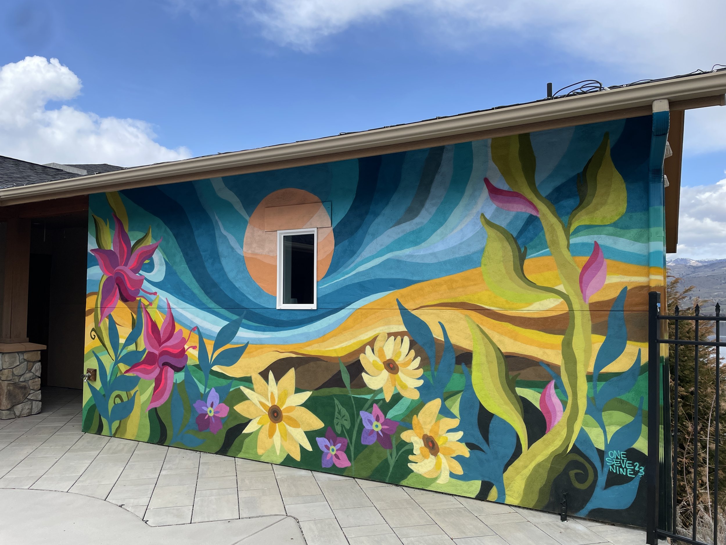
The most common question I receive is “Angel, what is your favorite color?” and I always reply with “For what?” Because it’s not that easy of a question! The quickest answer is ‘All of them’, but honestly they all do different things therefore it’s hard to choose. It really depends on for what purpose. For instance, my kitchen has these beautiful red cherry cabinets, so I want the colors of the items I use to not clash, so they’re all this soft sage green. My bedroom is where I wake up slow and have quiet mornings, therefore it’s filled with a soft teal so the sun can dance around the room. My art studio is gallery white to make all the artwork in my space illuminate. When I paint, you can see from my work I use all of the colors. While you might see repeats of some color schemes, I really love seeing how I can use color to tell stories, invoke emotions, and help move the viewers eye throughout the piece.
ROYGBV + many more!
Because we grew up educated with the 🌈 ROYGBV (Red, Orange, Yellow, Green, Blue, Violet,) palette, we have a strict take on how colors work. We’re taught about Primary colors and how they make Secondary colors i.e. Red + Yellow = Orange and Green + Yellow = Blue. But there are so many variations just within that one color category. We rarely utilize what are called Triadic Colors, you know colors in-between; YellowGreen, BlueViolet, RedOrange? Ask any artist about how they use color, it’s totally all different and really tied to their identity as an artist. Personally, I think the way color is taught is a flawed philosophy.
As artists, we’re challenged to experiment. If you want a Purple, depending on the red and blue you use you can get a Magenta Purple or Blue Purple. Notice how they are all 3 different Purples? We’re also taught if you want to lighten a color to use White (tint) and to darken it we use Black (shade). Claude Monet famously said that black isn’t a color at all. Monet completely omitted using it in his work because it didn’t exist in nature. Bob Ross loved his Titanium White as we all know and love. Did you know you can also use yellow to affect your color with interesting results? And if you want to darken a color, did you know it can use its complimentary color instead of black? This is why the possibilities of telling stories with color and art is so incalculable; it’s all how you see the world around you and then how you translate it with your artistic lens.
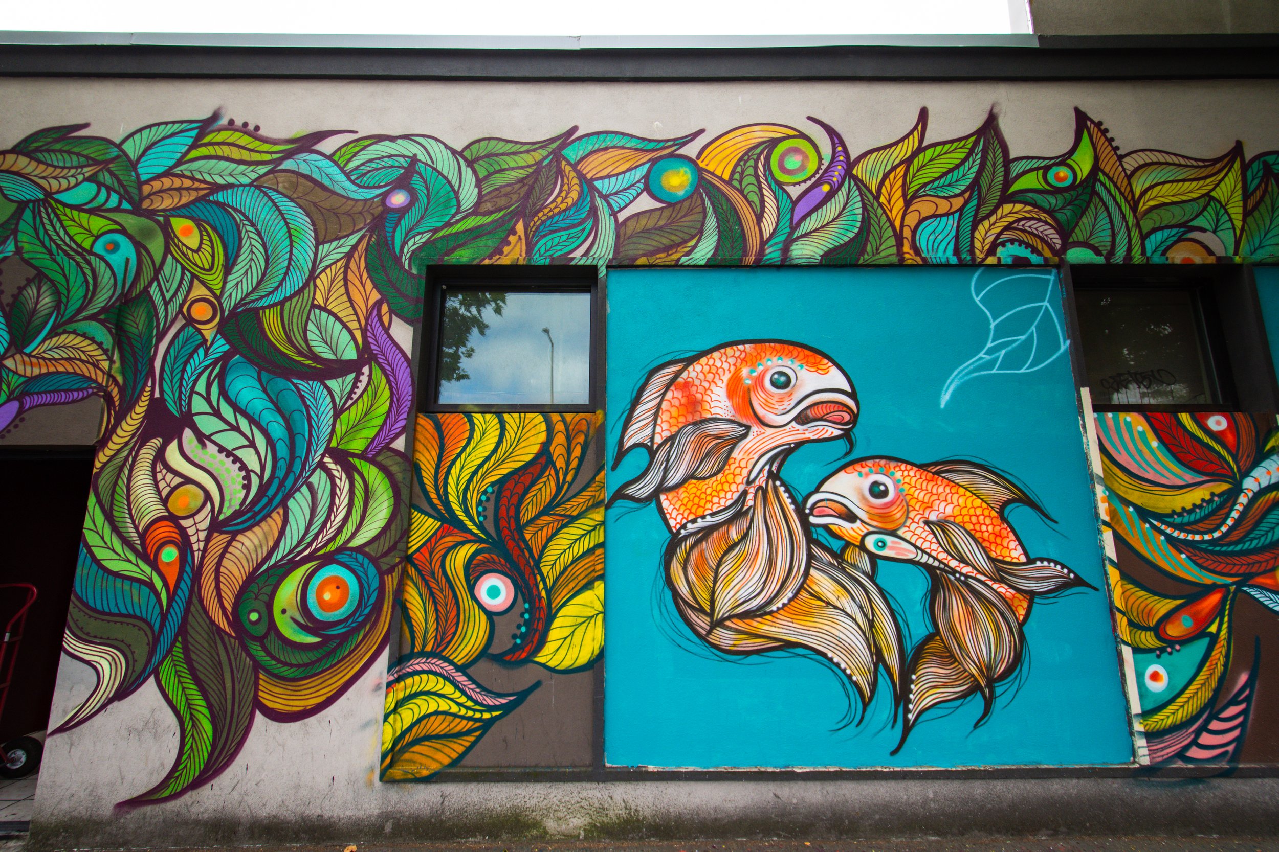
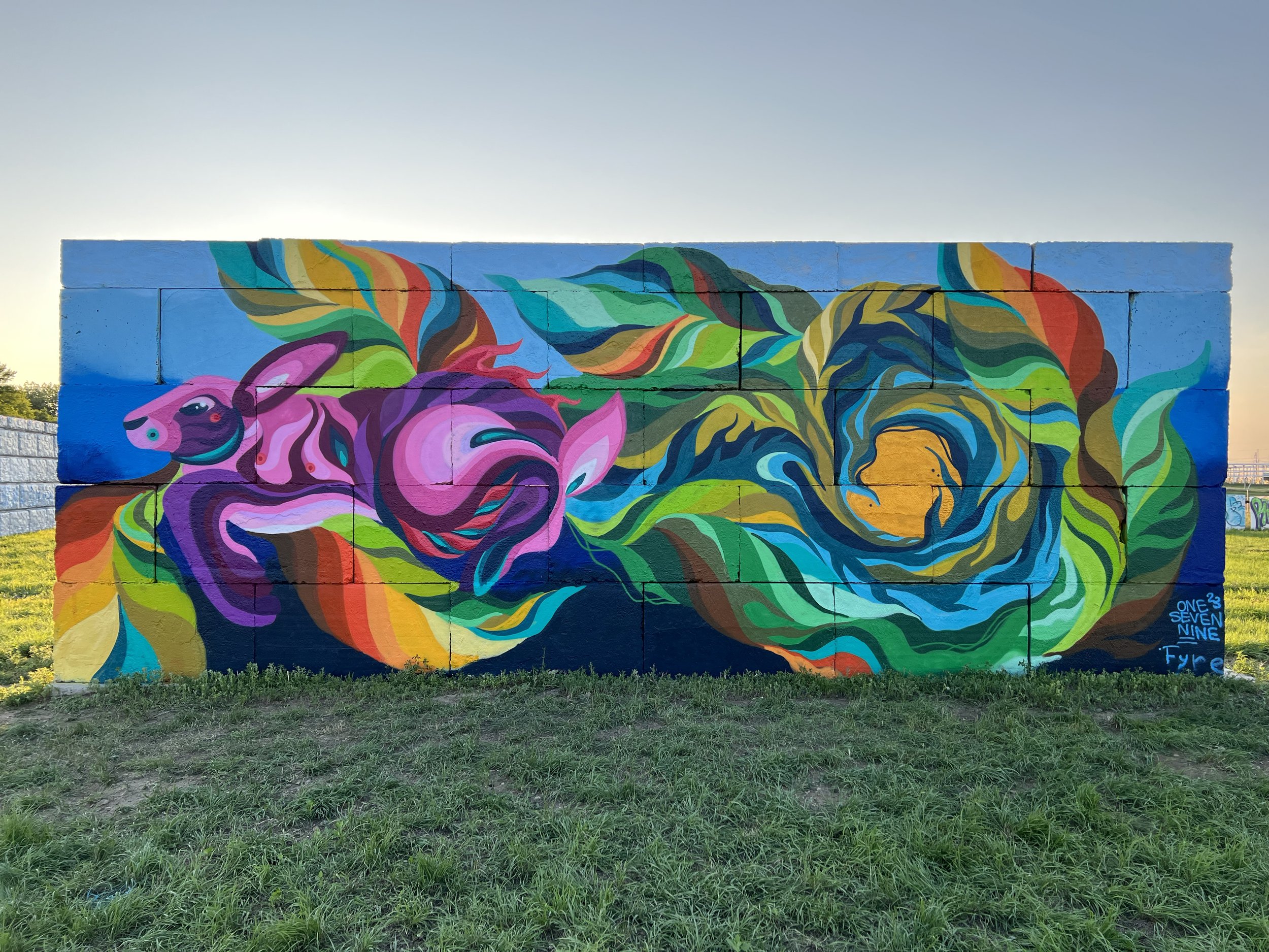
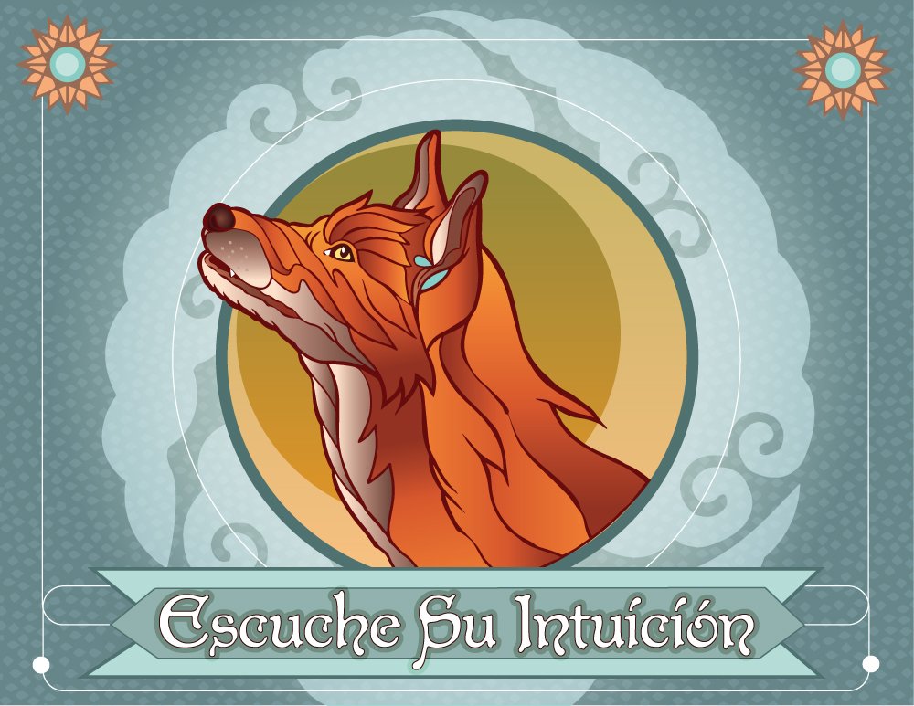
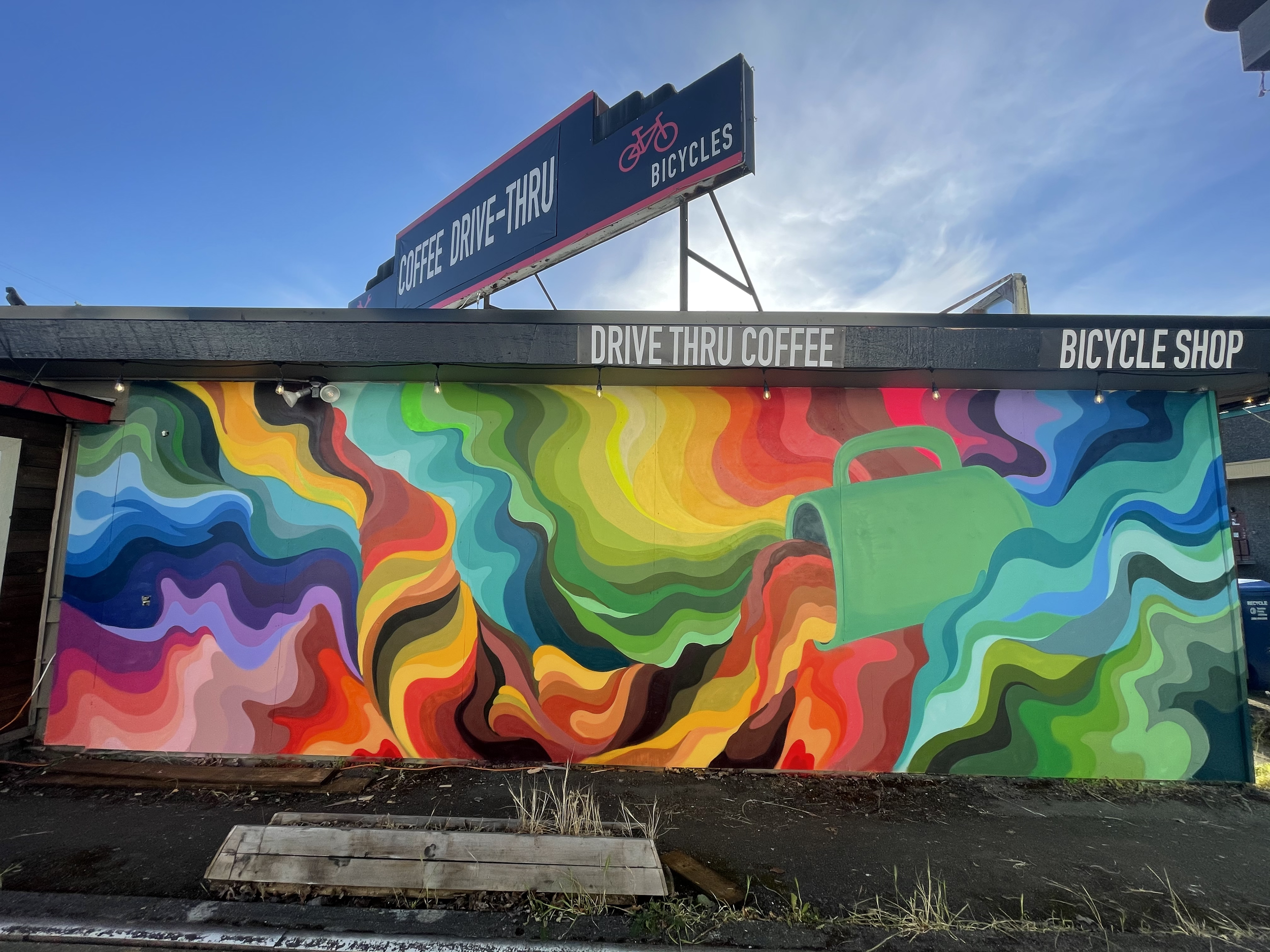
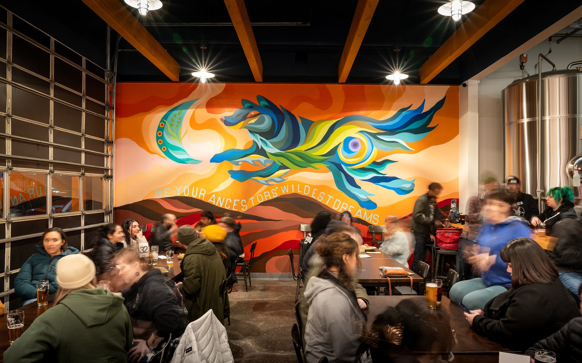
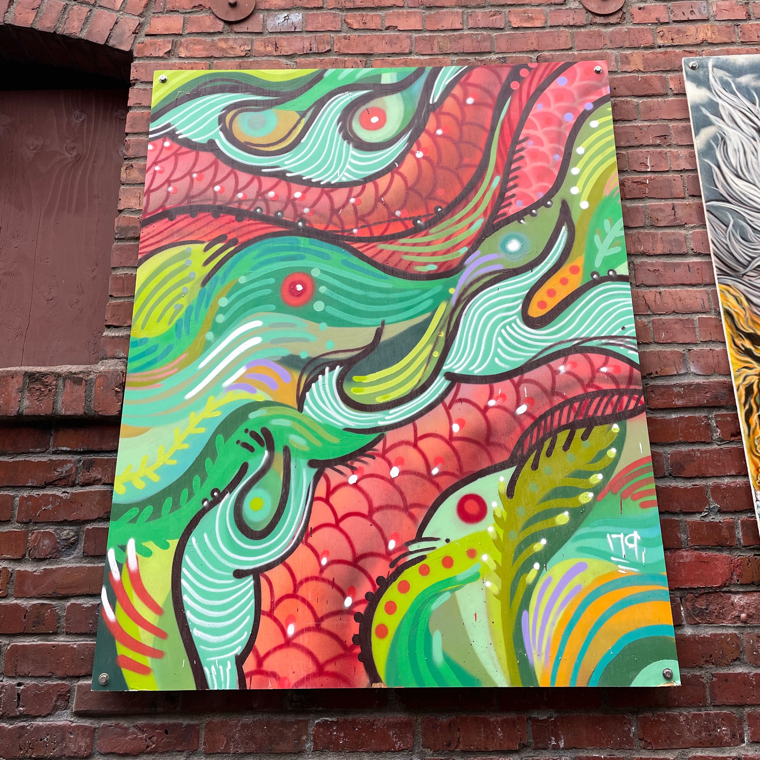
Complimentary colors in the murals above: 1. Goldfish= Blue + Orange 2. Rabbit= RedViolet + YellowGreen 3. Fox= GrayBlue + Orange
I talked briefly about using complimentary colors and one of the ways I love using them is to hyper-intensifying them. A complementary color is just a color on the opposite side of the color wheel. When paired, they’re supposed to work as a partnership, but at 100% it’s a little much. Personally, I perceive color how I perceive volume; if you turn up the volume on all the sounds in a room, you won’t be able to hear who you’re speaking with. But if you turn down everything else, you can hear the one conversation you need to.
I illustrate this point in the diagrams below. If you take the complementary colors Red and Green in Image 1, what comes to mind? Christmas 🎄? Sports team 🏈? See how it’s a little much? The colors are competing against each other because both are talking at the same volume. Depending on what you want to say, you can adjust the volume of the colors to get your message across.
For example, if you turn down the Red, you’ll amplify Green in Image 2. What does this second image say to you? Now put a microphone to Red and tone down Green. Do you notice how it changes Image 3? One seems playful while the other mature. You may also soften the overall look and turn down the volume on both of them in Image 4.
Now, if you’d like to experiment and get a little squirrely, you may get all kinds of fun outcomes mixing versions of the colors together. Green can be easily adjusted to a Mint Green and Red to a Salmon Red and the next minute you’re transported to some tropical island holding a fruity drink for Image 5. Now, which of these is your favorite and why?
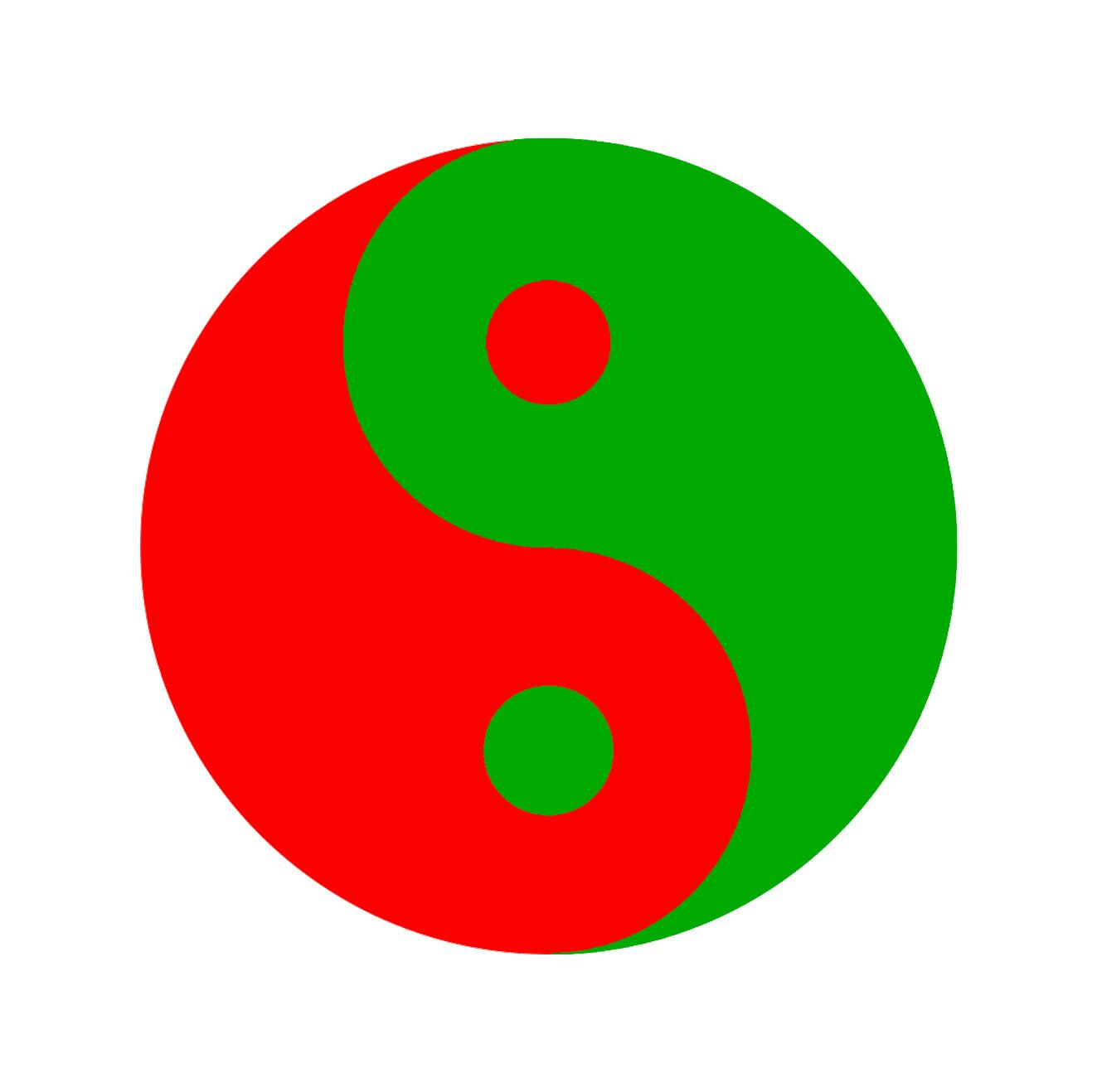
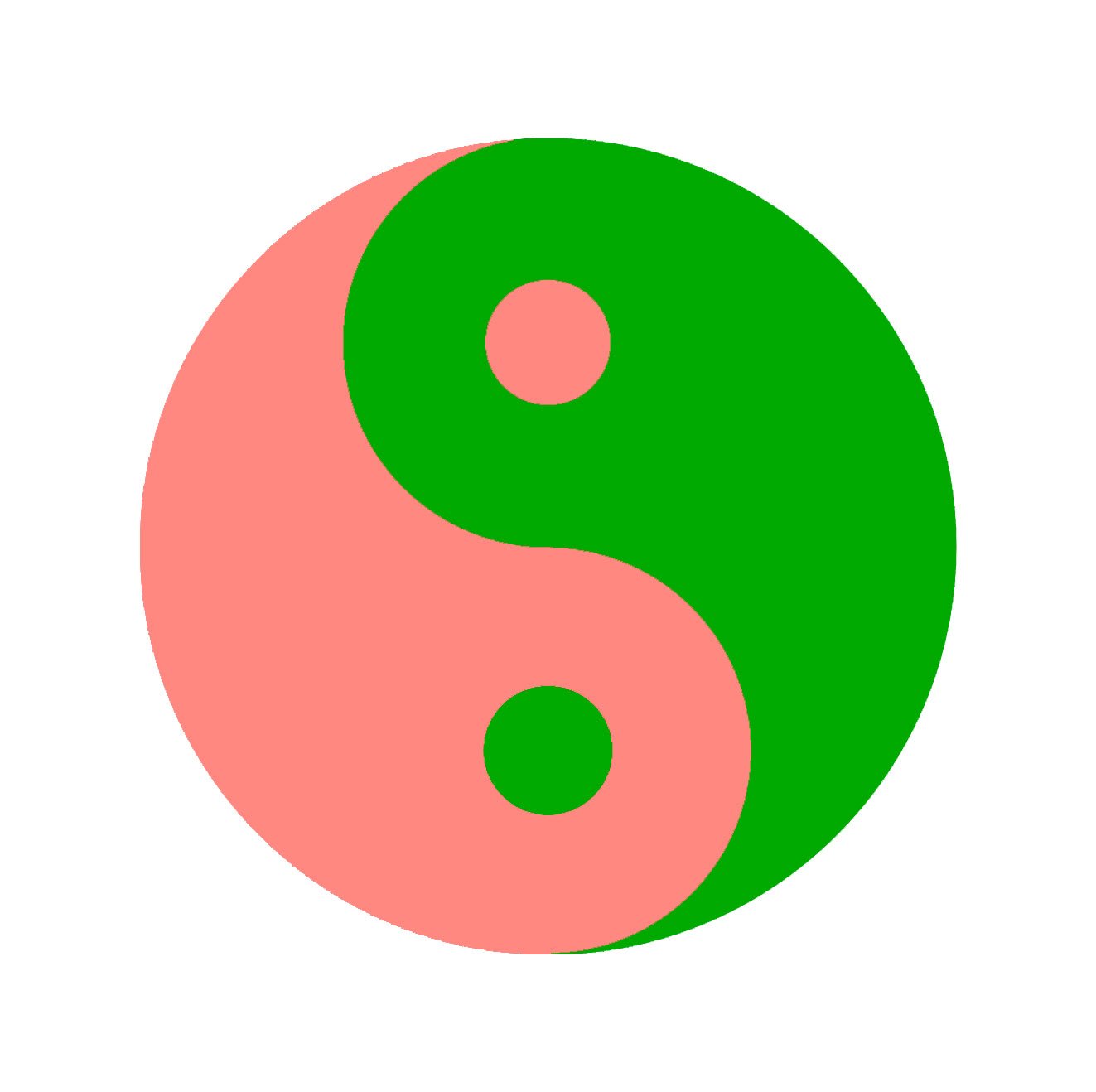
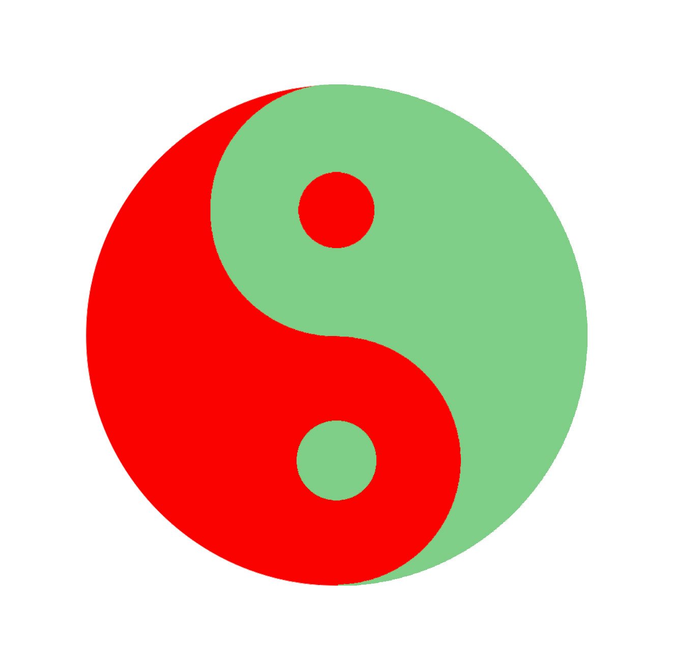
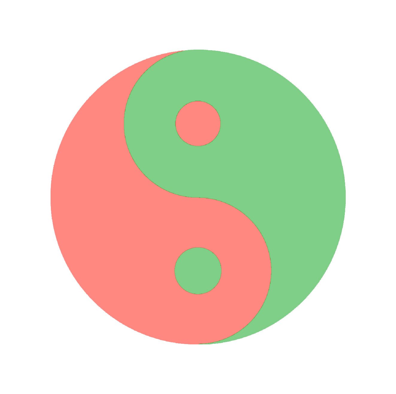
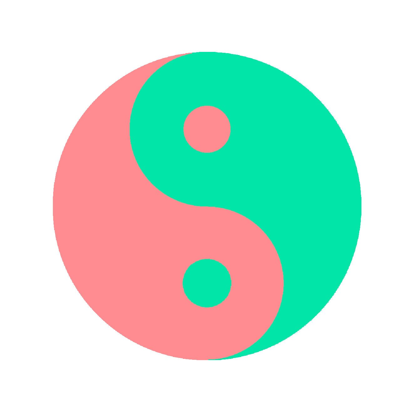
Special Note: if you notice the diagram in its totality, it tells a story of rigidness to experimentation, understanding, and finally resolution.
“Peach Fuzz isn’t just a color; it’s a mood enhancer,” Muralist Angelina Villalobos says, “it exudes a quiet strength, adding depth and warmth to any palette or room.”
That was fun right? See how we can tell a story with colors? Based on the message you want to convey, you may also use them to set moods. While I love vibrant colors like teal, vermillion, and magenta, there is quiet strength in soft colors. Pantone’s titled Peach Fuzz as The 2024 Color of the Year. I was quoted in Apartment Guide’s recent article 2024 Color of the Year: Spring into Style by Learning the Meaning and Mastery of Peach Fuzz on my take for using Peach Fuzz in my murals and artwork. The article is insightful with a really well informed take on how to use this color in all kinds of settings. Pop on over and check the rest of it out at ApartmentGuide.com.
Color isn't just about presence; it's about balance. You’ll also notice by adjusting the intensity of individual hues, I can guide the viewer's gaze. I can start with a vibrant color and then move to its paler version. From the whisper of a pastel to the boldness of a neon, each color choice adds depth and dimension to the canvas.
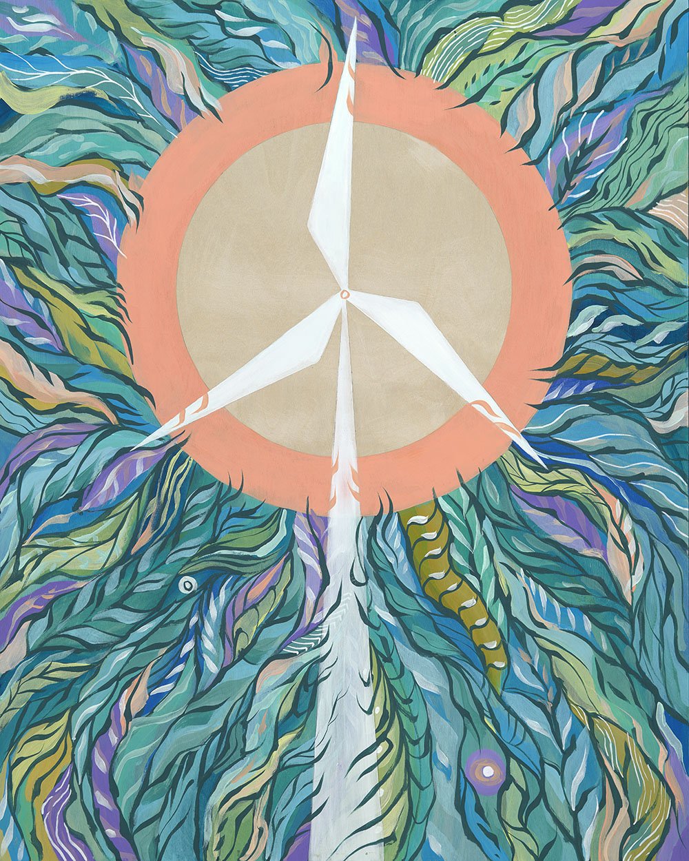
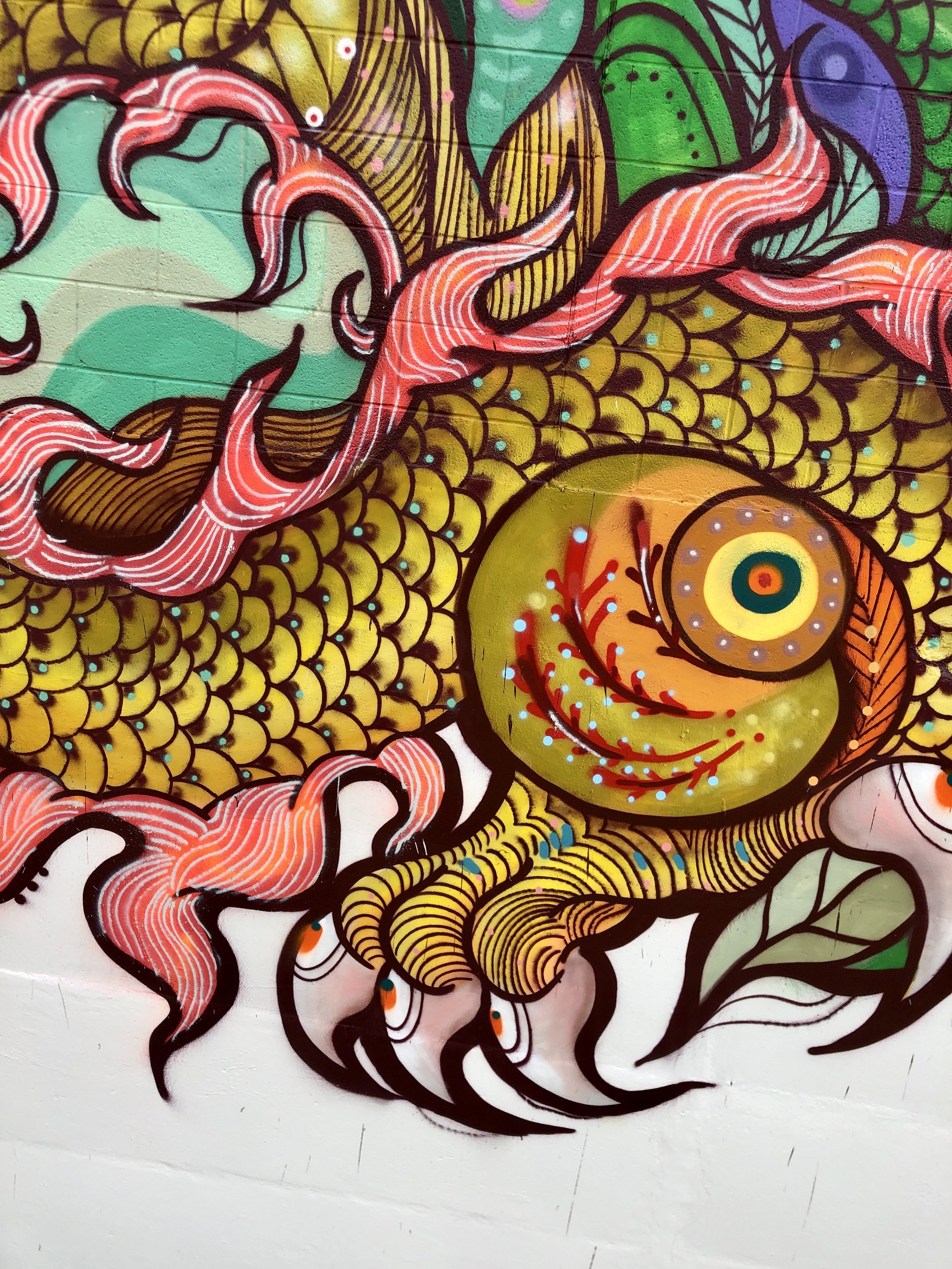
2024 Pantone Color of the Year Peach Fuzz in some of my past work.
A special tip of the hat goes to what I can only describe as 💩 The Poopy Colors 💩. Colors like Mustard, Olive Green, Gray-Greens, and Gray-Blues especially. I feel like these are great Steve Nash colors. You know, colors that are the kings of assists and help the vibrant colors evolve into BOLD colors. It’s like you need the build up of a song for the crescendo to really have that emotional impact to make you want to sing that part at the top of your lungs. I’ve learned to love and cherish these colors just as much as I do the vibrants. But I probably also need a better name for them 😬.
Finally, I mentioned above that I don’t like to use black unless it’s absolutely necessary. For my Gloria Mural, the background of the murals were painted black to help upkeep with vandalism, but to also give uniformity to all the murals on the block. I utilized the black of the background as a design element in the hummingbird with cutout shapes interwoven into her body. In the leaves I use a very dark green as the darkest value instead of black from the background to give contrast and range between the lightest green to the darkest green and to seperate the foreground from the background. You may also see this technique in the hummingbirds head as well. I transition a very light pink to aubergine to define her head.

Gloria, 2022
The lightest grey green act as a white highlight giving a subtle contrast to the dark green in the leaves without it being too harsh on the eye.
Can you spot my use of complimentary colors in this mural?
I started transitioning away from what I’ve learned is called a “line artist” in 2021. In the beginning of my art career I considered my work an illustrative style. Using line-work and patterns to build shapes and having my colors take a secondary seat underneath. But I found that the colors were lost behind the black lines so I started using dark colors such as Dark Blues, Aubergines, and Deep Purples in place of black. This adjustment is gentle on the eyes and does more for color harmony than just black. Since my mural for Meta’s OpenArts program unironically titled Somewhere, Over the Rainbow, I discovered I wanted to use color against color to define my shapes. I found that I could be more free with their use and really embraced pairing colors together to tell stories.
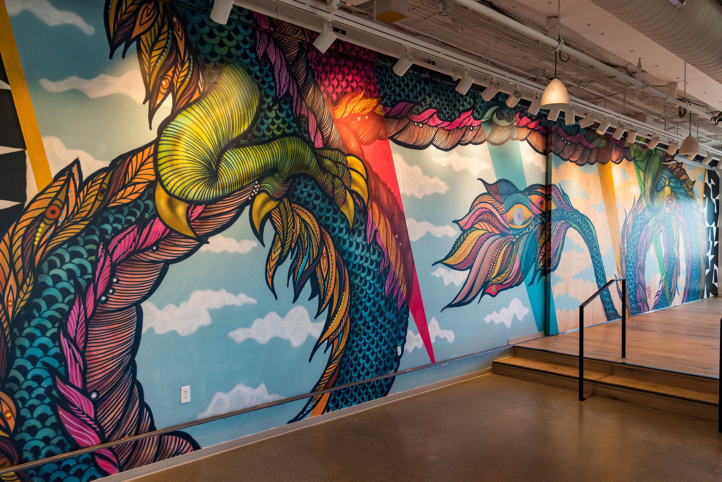
Examples of murals with outlines in: Aubergine & Blues
In true 179 fashion, I created a playlist of all songs color-themed. You know I love a curated playlist to paint to! A recent TikTok trend asks “Who is your Yellow?” meaning who makes you happy? And I think we can all identify with how colors affect our moods and interpretations of the world around us. This is one of the pillars of why I do art. I want the colors I curate together to help viewers define their thoughts about the pieces I create.
I hope this short but sweet entry helps you understand how I see color in this beautiful world we live in and it inspires you to explore how you view color. Colors mean so much more to me than just something pretty to look at. They represent ideas and emotions. So, I’ll leave you with that homework assignment, find your yellow and paint about them 💛.
In Color We Trust,
Angelina 179 Villalobos Soto
