
Grand Central Bakery Vinyl Mural

is a love letter documenting my murals and community partnerships. Please enjoy!
This is the most delicious mural to date. I am such a little piggy for Grand Central Bakery’s croissants. I love a good carb!
I was invited to put in a little bid for the relocation / updated of their newly constructed Eastlake location. Margaret from Counterbalance Studio was curating the art and design for this new location and really made the process so delightful. After a delightful interview, I got the call for the go ahead and it was magic from then on out.
In our interview meeting we talked of the goal of this mural and what they’ve been doing in their other location. We wanted to something bright, joyful and colorful, a mural that celebrates the community forward culture of GCB.
When I do commission work I like to start out with an informative meeting. Where we sit and discuss the goals of the project and brainstorm some themes the client might possible want to go in. Most of the time my art brain already starts formulating an idea of a direction I would like to go as we have the meeting and it’s always a challenge having to contain my excitement. My approach is to send over 3 versions of a mural. The first one is always conservative and reserved. I want to ease the client into the art making process, especially if this is their first time commissioning an art piece. Projects like these are supposed to be fun. The second design is usually fun, playful, and more of my artist eye in it. It’s got my quintessential 179 flair for color and movement. The third design is out of this world. It’s if they let me paint on everything and anything. It’s the wildest dreams of the client. I find this approach is so fun for the client. It leads to really insightful conversations around art and their space. It’s so easy to slip into what you DON’T want rather than focusing on what you do want. Having options such as these, clients are more likely to be happy with at least one and in most cases choose to combine elements of them into each other and that is exactly what happened here.
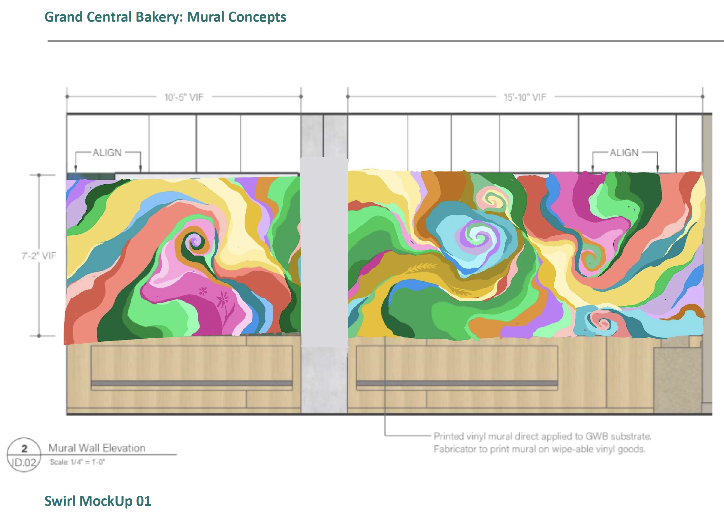
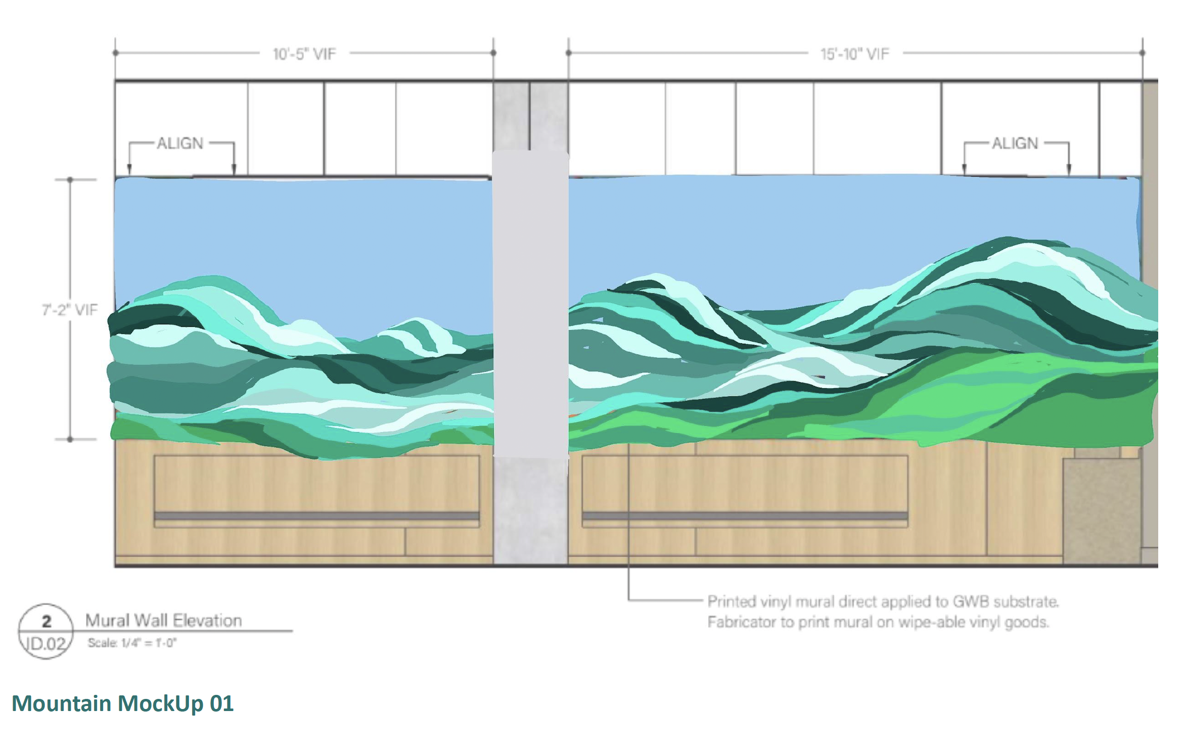
For our second check in, I presented the group with 3 options based on our initial interview. The first was a scene of colorful swirls of color in an abstract form. The second a flower scene of native flowers of the Pacific Northwest. Lastly a portrait of our beautiful Tahoma mountain. I felt each of these potential directions would be so fun in their space and captures the goals of GCB in their own right.

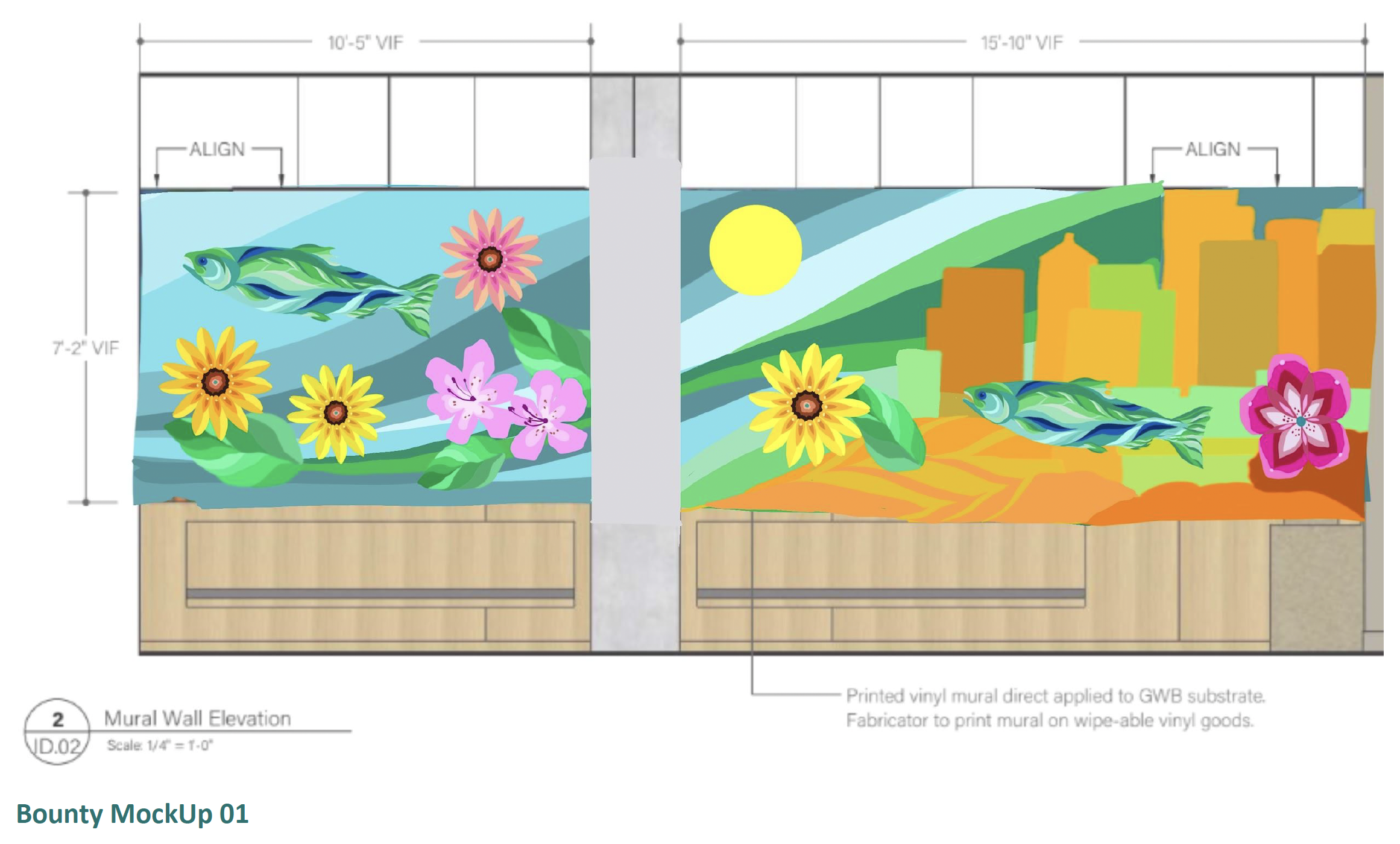
The Second Draft combining the 2 designs I presented.
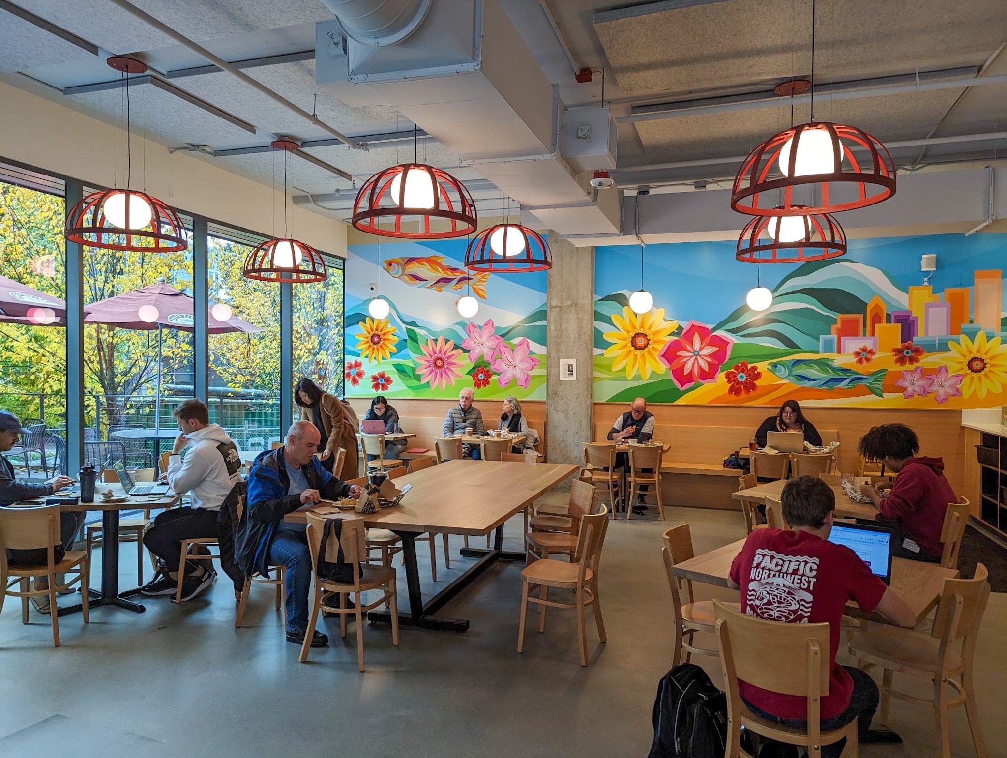
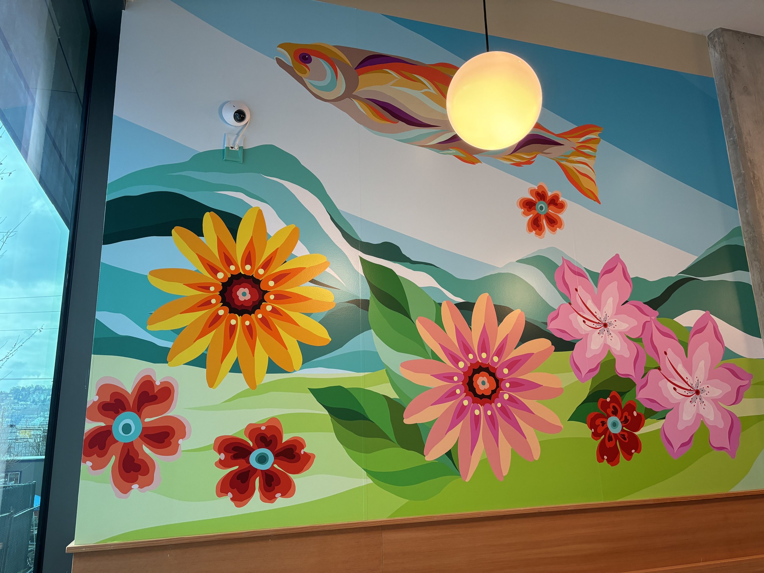
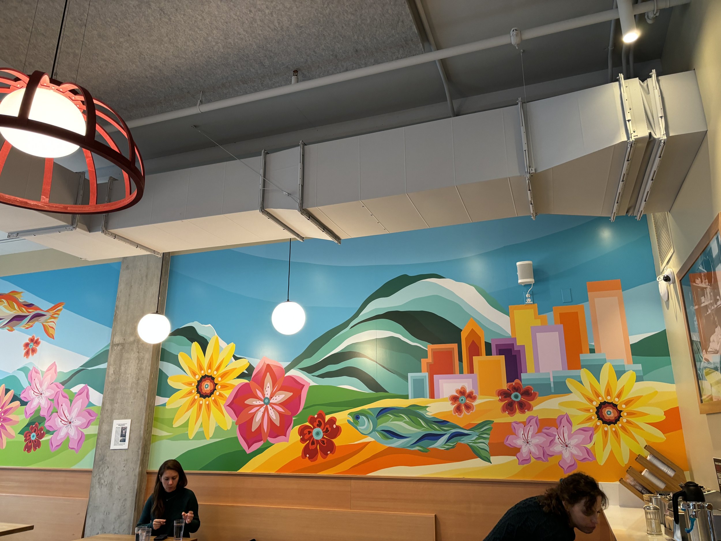
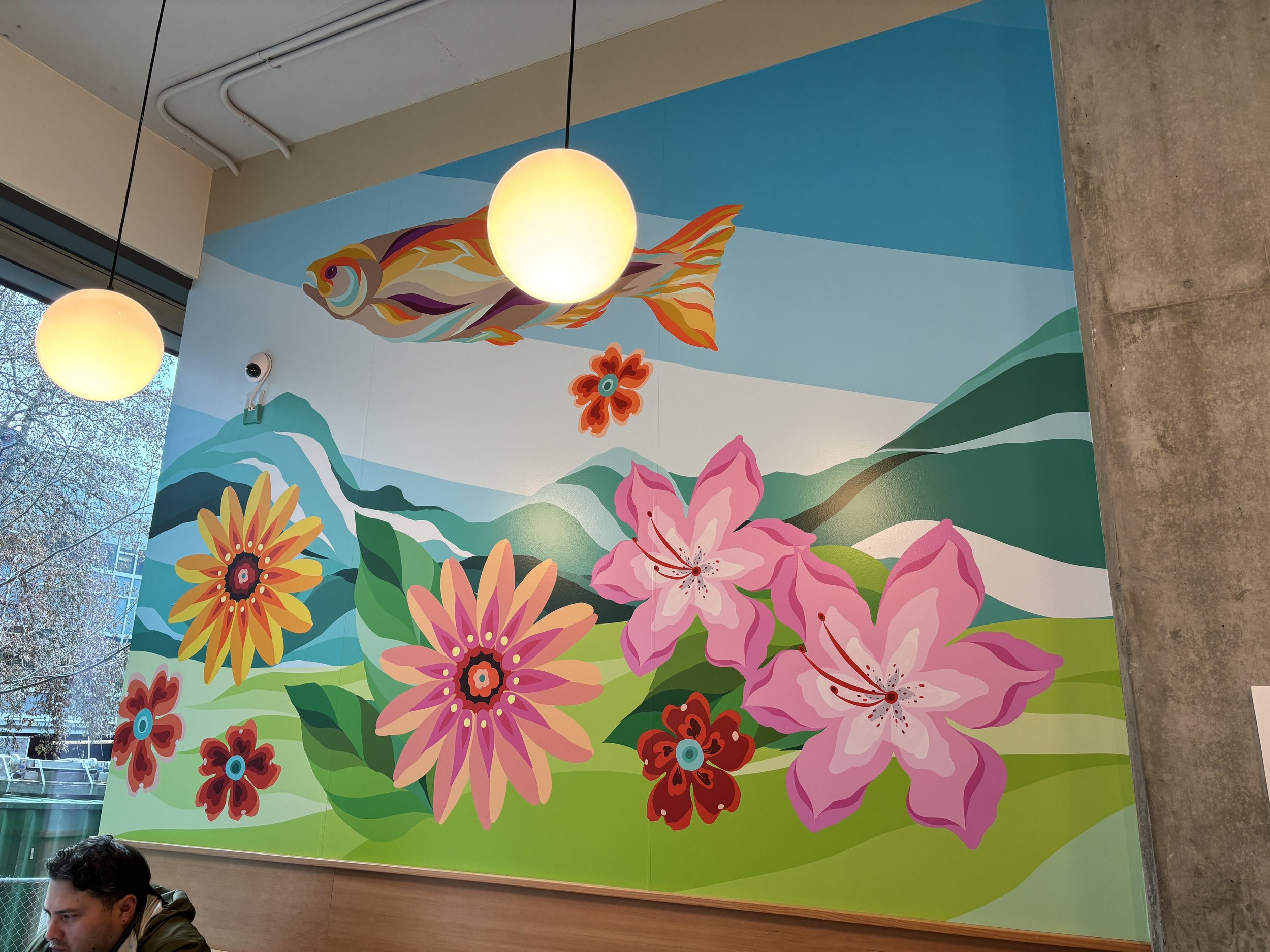
We chose to select the background of the moutainrange that could be indicative of either our glorious Cascades or quiet strength of our Olympics. We then added flowers and a skyline of Seattle. GCB really loved the little salmon element. I wanted to highlight the beautiful transition of the life of our precious salmon so I have one in Seattle’s team colors and another in more of the spawning colors they change into when their ready to make the journey back to their birth. I added more gold and yellows to the space underneath the city. It’s a hat tip to the golden fields of wheat without being too literal. Since moving to my little beach home where I inherited 15 rhoddedenrons, I've fallen in love with gardening, specifically flowers of the Pacific Northwest. In this piece I added little rhoddies, black eyed Susans, and an artistic take on the dianthus.
I was sent a sample of the vinyl printing from MacNamara Signs. It came out so wonderful! I did have to adjust some of the colors as their values were too light or dark. This happens, the colors you see on your screen, in my case it was the iPad and printing sometimes just doesn’t match up. Generally we view screens in RGB which stands for Red, Blue, and Green. The printing world uses CMYK for Cyan, Magenta, Yellow, and Key or K for Black. In different variations of percentages, colors are created. And then you have the paper or material you’re printing on to consider. All of which can affect how a color shows up. Since I use literally all the colors in the world, I need to be mindful that there’s adequate shades and hues so that they all shine individually.

The Third Design
The major challenge of this design was working with technology. I used a new program called Freso, an Adobe product. This program allows me to draw with live vector brushes. The reason this is so important is if I were to use Procreate, it would be a raster-based program, meaning it’s pixel-based. When blown up to the size I would need the image would be very fuzzy. Additionally the file size needed would also be too large for the memory in my iPad. Drawing in a digital vector format allows me to keep my file size smaller with the ability to enlarge this design without pixelation or fuzzy lines.
The second round we chose to minimize the city scape and move the flowers around. In the new location re-design the was a pop of color added of this really gorgeous rusty red and we wanted to add this to the design in some capacity. I chose to add it in the form of little blossoms swirling around in the wind. This mural is so elegant, it has the touch of whimsical that makes me so happy. I added some texture to the city and layers to the little red flowers. I also adjusted the colors of the city to be more complimentary to the rest of the scene switching out the greens for a more subtle blue.

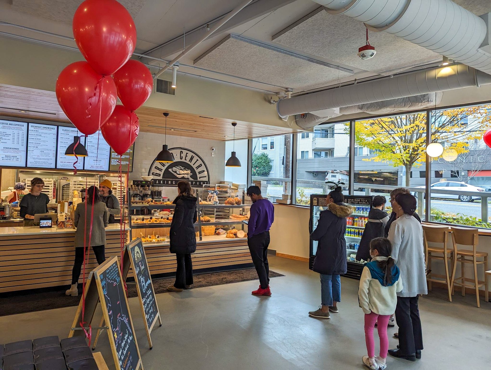
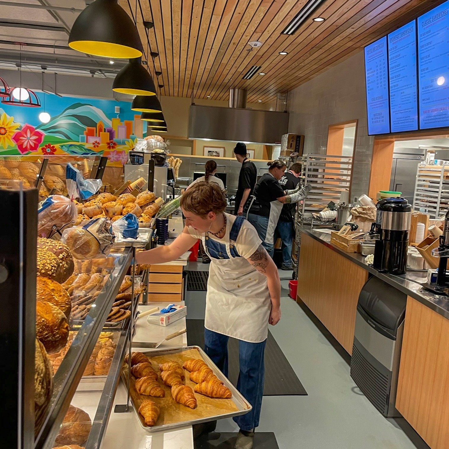
The final Design + Installation
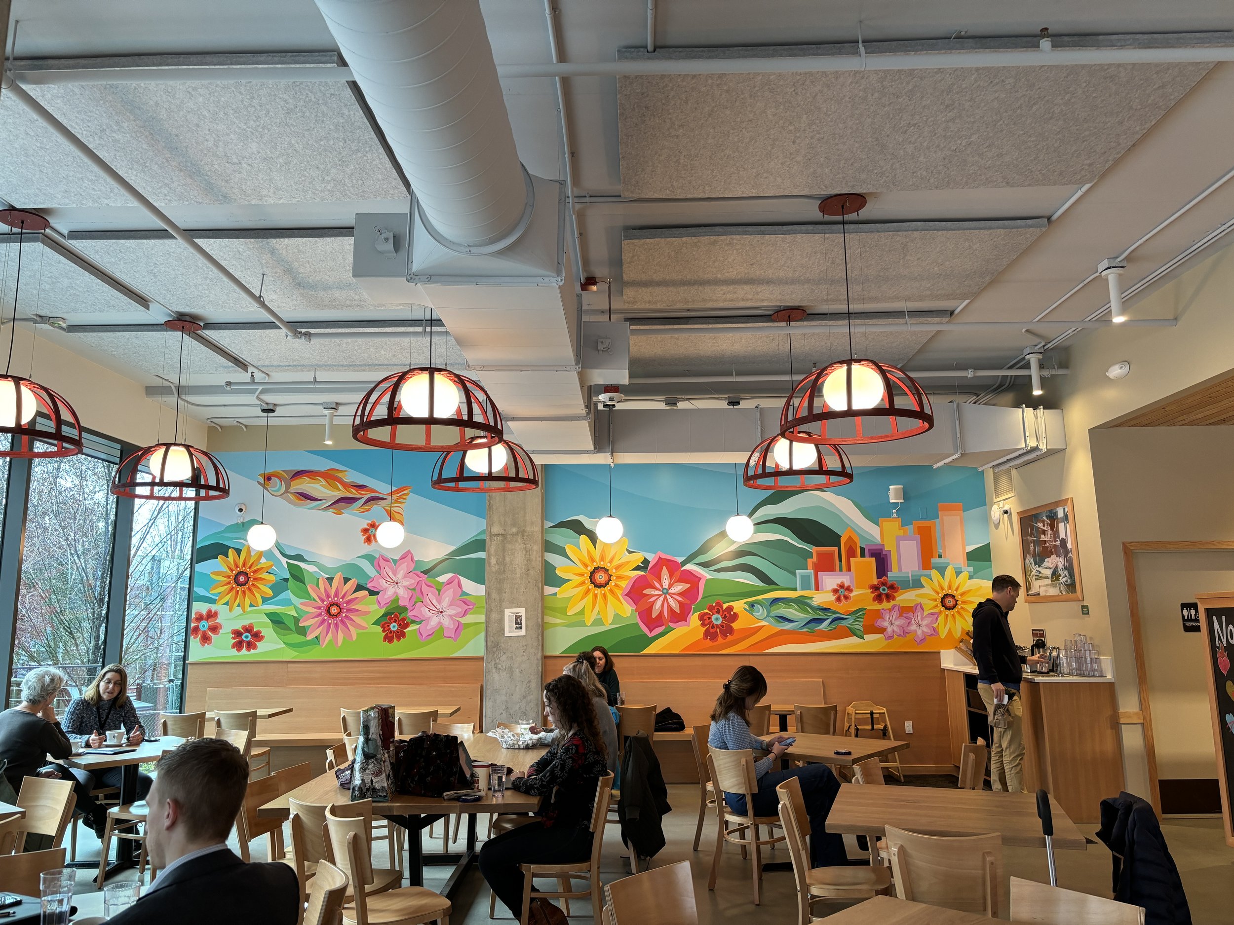
This was just a special project and one that I really appreciated how supportive I was through this whole process. It was very easy and came together so well. Sometimes you get a dream client and Grand Central Bakery was that very client! Major thank you to Margaret from Counter Balance Studio for selecting me to bring joy to this space.
Artfully yours,
Angelina V.

For all your spray paint and mural supply needs.
WWW.ARTPRIMO.COM
Mention my name for some extra love ❤️.
This is a post for all subscribers, big and small, I appreciate you all.
My Office for the Day is a reader-supported publication.
To receive new posts and support my work, consider becoming a paid subscriber.